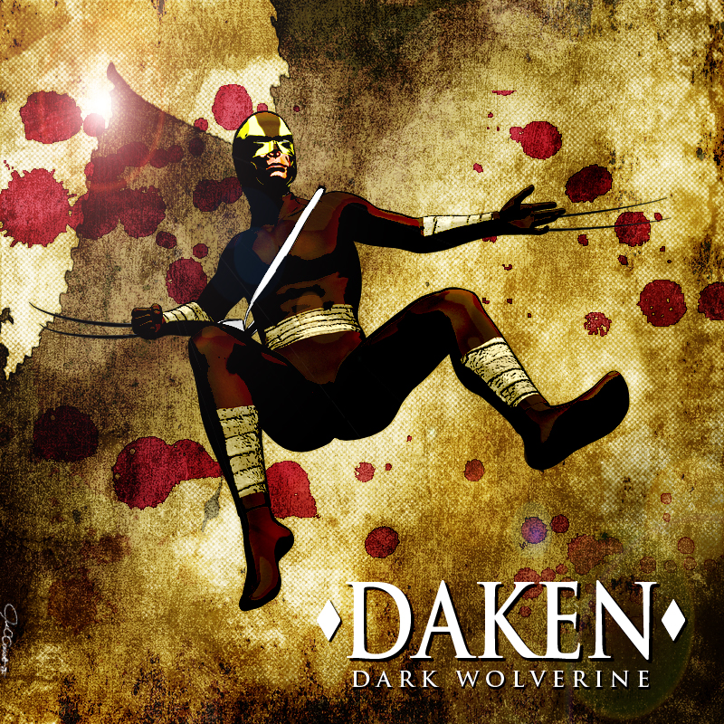
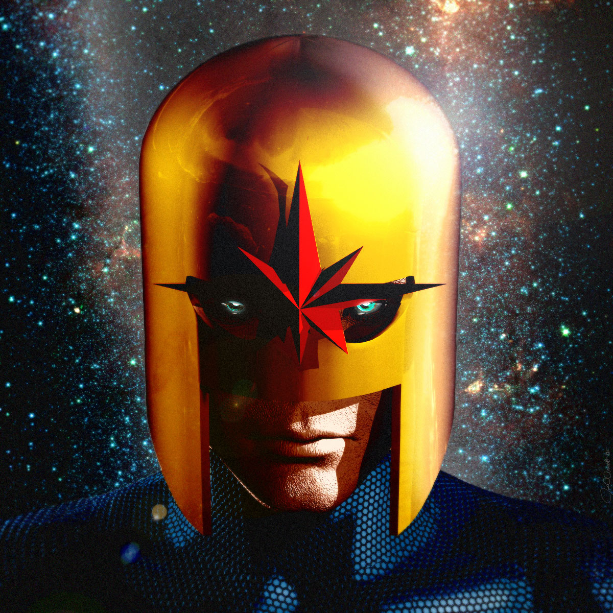
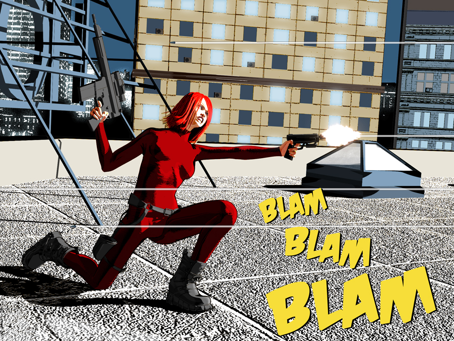
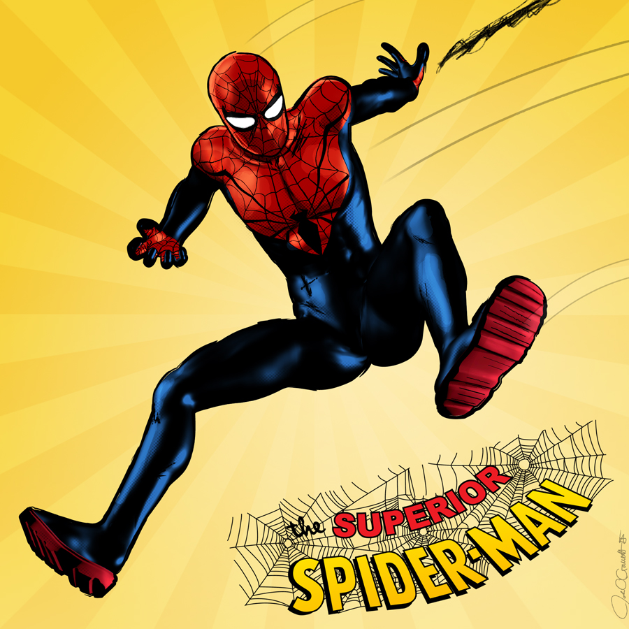
When I was a kid, I drew all the time. Drew on everything. I got in trouble for drawing on walls, on desks, the covers and interiors of books, not to mention the reams of paper I drew on and then just littered the house with.
Many times in school I would crack open my notebook to study for an upcoming test, and instead of useful notes I would find a drawing of Spider-Man or She-Hulk or something.
Oops.
Don’t worry, I passed the tests – but it didn’t matter, because I always just assumed I would grow up and work for Marvel comics one day.
Well, I never did. As time went on I had to face a hard truth: My drawing ability was just not good enough. My issues were manyfold:
- The truth is, I have serious problems with perspective. Despite reading numerous books on it, as soon as my eyes left the examples on the page, I couldn’t figure out how to put my characters correctly into the scene. It was always frustrating and time-consuming to me.
- Additionally, anatomy was a recurring problem. Every once in awhile I could really nail it, but most of the time my work just looked really cartoony. There’s a place for that kind of work, no doubt, and I even have a couple of comics that I feel work really well with that style, but I didn’t feel like it did justice to some of my other stories.
- Backgrounds, backgrounds, backgrounds. Everyone knows by now, a good comic book artist has to be able to draw the city, the planet, even the universe around their characters, and it has to look like they belong there. Backgrounds became a real chore to me, and given my trouble with perspective, they didn’t come out quite right most of the time.
- Consistency. With all three of the previous issues, keeping the art consistent from panel to panel was often a near-impossible task for me. Again, it just wasn’t good enough.
Certainly not good enough for Marvel or DC. But more importantly, it wasn’t good enough to tell the kinds of stories I wanted to tell. At least not the way I wanted to tell them.
That meant if I ever wanted to tell those stories I’d have to either:
- Draw it anyway, and always know that it wasn’t the best version of my story.
- Hire an artist who could draw it the way I wanted.
- Just give up.
Honestly, I didn’t like any one of those options.
(Click the image below for some examples of my hand drawn comics. This style fits with my humorous comics, but I was never satisfied with how it looked on some of my more serious comics):
What’s that? Daz Studio, you say?
One weekend I was hanging out at a Border’s bookstore in downtown Milwaukee (obviously while they were still in business). I used to go down there to check out art books, trying to pick up tips on becoming a better artist.
This particular time I was over by the magazine racks, and I spotted a cool looking magazine called ImagineFx. It had a lot of tips from artists doing sci-fi and fantasy art, which I also tried my best to create.
Deep in the bowels of the magazine, an artist’s quick little quarter-page interview changed everything. The artist spoke about drawing comics, and using Daz Studio, a “virtual photo studio” to help him with perspective.
Essentially, if he had to draw a room from above, he would quickly set up the props in Daz Studio, change the camera view to the necessary angle, and then he’d have a solid reference for how to draw the shot.
Wow, that was something I sorely needed. I bought the magazine and rushed home to download Daz Studio 2!
I truly wish I still had that magazine so I could name the artist, but after several apartment moves over the years I ended up dumping a lot of my older magazines, and it’s now lost to the ages…
…but anyway, I downloaded Daz and was determined to use it to good effect.
Daz Dreams Dashed Again!
Unfortunately, it didn’t work out as I had planned.
Even though I’d been using Blender for about a year, it had never dawned on me to use a 3D program to help my 2D artwork.
Blender was kind of a frightening beast to me at the time. I managed to use it to do some packaging mockups, but nothing truly creative. I certainly couldn’t model a human figure!
Daz Studio spared me from having to figure that out. Daz was what was known as a “Poser Clone”. Poser is a well known 3D application wherein you pose, shape and otherwise manipulate pre-existing 3D models to create a scene. While Poser was fairly expensive to me at the time (I believe it was $500-$600 U.S.), Daz was free, and the Daz developers made their money by selling digital assets and props (figures, clothing, hair, buildings, etc.) in their online store.
And as it turned out, Daz came with a couple of free human models, and many of the models on their store were free, as well. Plus, I could download free models from other sources and load them in Daz Studio.
Alas – although I faithfully recreated my comic scenes, rendered them, printed them and used them as careful reference, my comic work didn’t get noticeably better.
As the artist, I was still not creating what I wanted to create. I had a new tool, but the tool couldn’t change my basic art style or fix any of my artistic shortcomings.
Again, I was frustrated. Again, I had no way to create the types of comics I wanted, and my big 3D experiment had failed.
Or, had it?
I thought again. Yes, using Daz Studio as a tool to help my 2D artwork hadn’t worked out as well as I’d hoped…but maybe I was using the tool the wrong way?
Hey guys, I think I can make a whole comic with this..!
I wasn’t the first person to come up with this idea. Not by a longshot. But that actually encouraged me even more.
Other people were doing this! The idea was valid! And just think:
- No more problems with perspective!
- No more problems with anatomy!
- No more problems with backgrounds!
- No more problems with consistency!
Excited, I remember telling a friend of mine who also drew comics about Daz Studio. I said “Dude, you could really make a comic with this!”
His response?
Meh.
He didn’t actually say “Meh”, but the look of disdain on his face was pretty clear.
What he actually said:
“Would you really want to do that?”
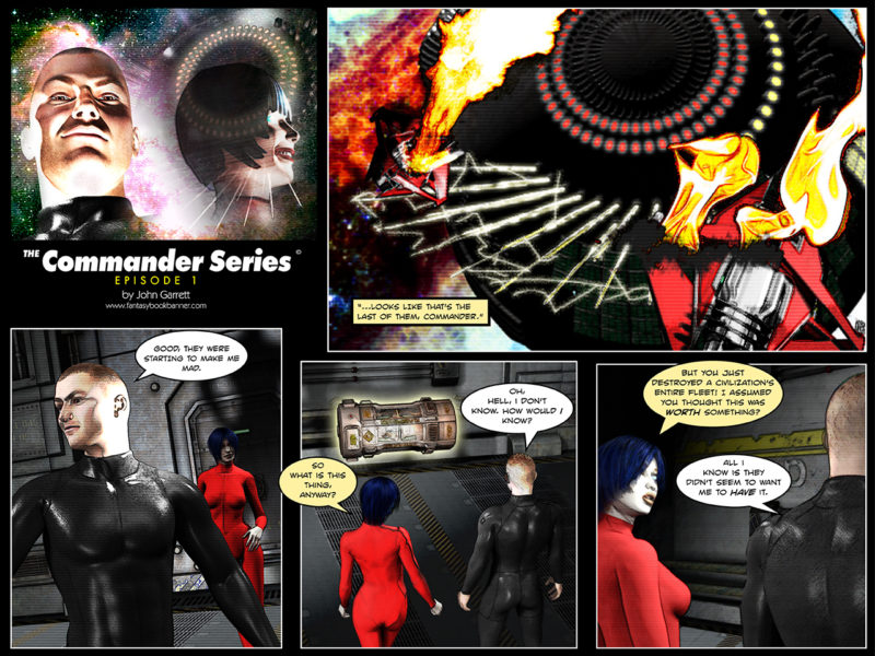
It was very dismissive, and it hit me pretty hard. I determined to make a kick-ass comic and show the world that my plan was worthy. I slaved over my computer, worked like a dog and finally created my very first 3D comic “The Commander Series”, which you can see right here. Click to view entire comic (warning: harsh language in comic):
Although I was proud of myself for finishing the project, I had to admit that it didn’t look as much like a comic as I had intended it to. It ended up looking like it was made by a guy who was trying to make a comic using mostly free stock assets of a free 3D program. I put a lot of work into it, but it still fell short of what my ideal comic would look like.
Those of you using Daz regularly will immediately recognize Michael 4, Victoria 4 and the Droid character I believe I got for free one week from Daz (although the ship itself I made in Blender). At the time I couldn’t really be bothered to put in the work to make unique characters, and the comic suffered for it. The textures and materials didn’t work for me either. Clearly, I was going to have to take a different approach.
More recent comic tries – Commander Series and The Life-Taker
Over the years I tried a few more 3D comics, never quite achieving what I was going for…just like my 2D work.
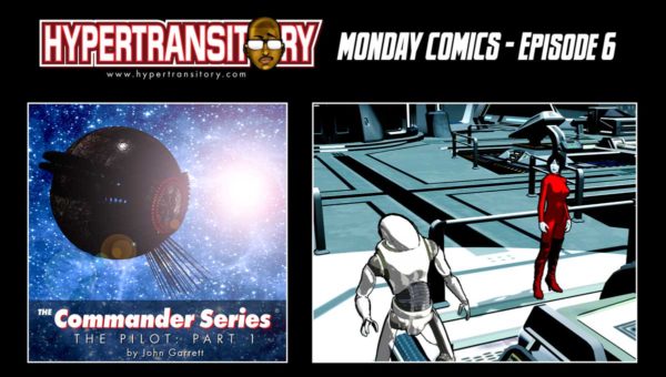
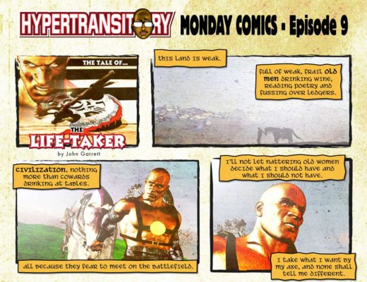
Here’s several comics, some updated Commander Series, and a fantasy-themed one called “The Life-Taker”. I was kind of throwing all kinds of techniques at these, just to see what would work. Sometimes even using different styles from panel to panel within the same comic (so much for consistency, huh?). Click these to view the comics (warning: harsh language in comics):
Again, although I was proud of these comics, I knew I still wasn’t realizing the true potential of what coud be done with 3D. I decided to hit the pause button for a bit…
And then…Anomaly!
Some time went by, and I had stopped creating 3D comics because of other time commitments just because I wasn’t really satisfied with the results.
During my usual comic-news related browsing, I saw a quick item posted about a webinar featuring Brian Haberlin, the author of a new graphic novel called Anomaly (long YouTube video).
Apparently, he had created the artwork for Anomaly using Poser, and was going to talk some about his experiences and methods. I signed up right away and was blown away but what Brian and his team were able to achieve, in particular the “Augmented reality” stuff they did was amazing. Luckily they posted the webinar on Youtube after it was over, so now anyone can check it out.
Even though I don’t actually use Poser, Daz Studio is kind of a “sister program” to it, and you can use most of the same props and figures between the two. So although the specific screens and such didn’t match up with Daz, the concepts he was talking about made complete sense. I would definitely give it a watch if you want to see how they did it.
In the video , they talk about how 3D has been used for decades to help artists make comics, and the confirmation of this statement can be seen in the comments section of that video by none other than Dave Gibbons of Watchmen fame!
They don’t particularly say how it was used, but I suspect it was used for perspective help with difficult angles and/or anatomy assistance – as I had tried (and failed) to use it earlier.
The graphic novel is a bit expensive, but I can see why. If you’re interested jump over and pick up Anomaly at Amazon. It’s a great coffee table book to have around, and also a great piece I like to look at to be reminded of what is truly possible with 3D.
The beginning of the method.
I still wasn’t making new comics, but I was determined to really create something cool, so I started seriously working on achieving the LOOK that I wanted.
I pored through the forums, Google, art sites and more to see if I could find any solutions, but there was nothing quite like what I was envisioning. Still, I was able to take some of the disparate tips I’d found and combine them into something usable in Daz Studio. Hours upon hours, test after test and render after render eventually bore some kind of fruit.
The first look I came up with was called the Ambient Method. Those of you who are familiar with Daz Studio know that the Ambient channel behaves somewhat like a light. It doesn’t glow, but shadows won’t cover any color or texture in the ambient channel, so it will always look as if it’s illuminated. In a nutshell, I started throwing all my Diffuse textures into the Ambient channel to see how it would work.
If you sign up for my list, you can get the Ambient Method chapter for free, but here are a couple of examples of the Ambient Method right now:
I used this method for quite a while, but then I stumbled onto an even quicker and better way (in my opinion) that I tend to use more frequently now.Re-Introducing…Kid Hype!
I know what you’re thinking…re-introducing?? I was never introduced the first time!
Yes, I came up with this comic many years ago, and I wasn’t very successful at promoting it. This was partly because I wasn’t really happy with the art and the way I was telling the story. It’s hard to promote something 100% when you feel like it isn’t 100% of what it should be. Or at least it is for me.
Let’s take a look at the original Kid Hype! artwork that I drew, scanned and colored probably waaaay back in 2010:
When I finished this one I remember thinking “That’s not what it looked like in my head!” Unfortunately that thought was commonly bouncing around in my head whenever I finished some of my drawings.
I wanted Kid Hype! to look more professional, to look more like the comics I pulled off the rack from Marvel, DC and Image Comics. This wasn’t it.
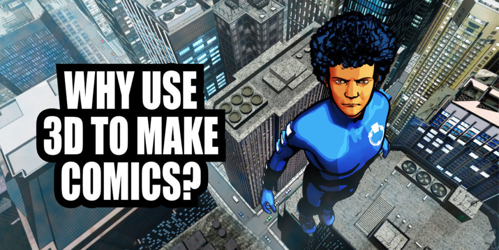
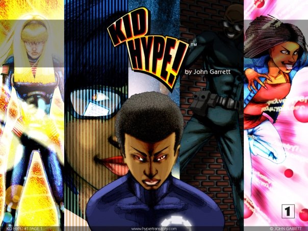
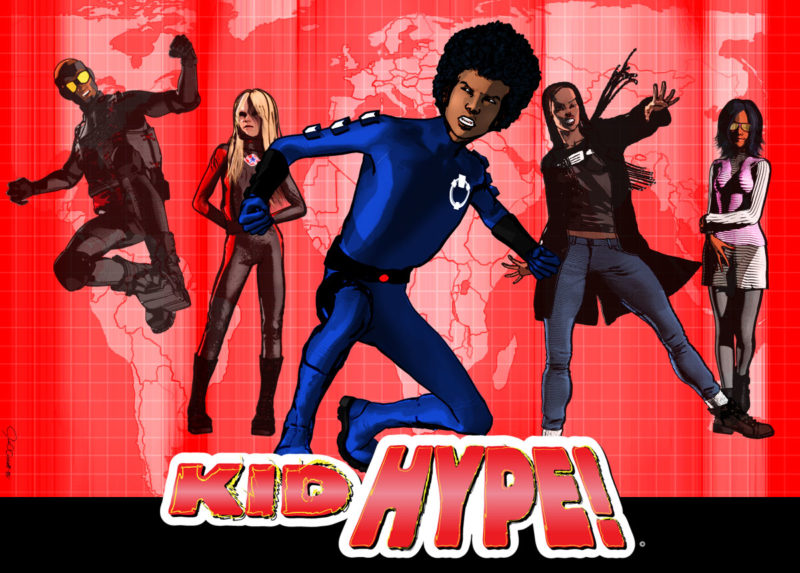
Now check out a more recent Kid Hype image from 2016 made in Daz Studio using the previously mentioned “better method” I’m now using instead of the Ambient Method:
I think this one looks a lot more professional. The characters are symmetrical and all in proportion. The method I used to create this one will be revealed in the full book, but for now check out another one of those original Kid Hype! comics from 2010 that I drew, scanned and colored the old fashioned way (well, if Photoshop can be called “old fashioned”):
My issues with perspective, anatomy and backgrounds can all be seen in this one. I did the best I could, but as usual I wasn’t happy with the finished result. That’s why I decided to bring this strip back as a 3D comic.
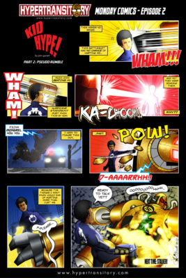
This newest one is a bit short on action compared to the older comic, but compare the art styles:
Again, I think it looks a lot more professional than my previous effort. Adding in the scenery and background actually becomes fun when you’re using 3D props, so you don’t have to skimp on it. Plus, the perspective naturally works itself out and you don’t have to worry about getting it wrong or drawing those darned grids (and then still getting it wrong).
I turned this one into a 4 panel strip, unlike the last go-round. As you can see from my Commander Series and Life-Taker comics, if left unchecked I’ll just keep adding panels until the comic is a half-mile long. I really want to tighten up the writing on these and see if I can tell a story within 4 panels each time.
I’ll likely tell larger stories in comic book form, though. Hopefully build a following with free four panel comics, then see if people are willing to support a paid comic book. This one hasn’t debuted yet, meaning I haven’t decided what domain it’s going to live on, but eventually it will go live. You guys just get to see it first.
3D Comic Creators UNITE!
Once I started seeing real results, I knew I had to show it to everyone who wanted to make a comic, but had felt limited by lack of ability to draw (among other reasons).
I was calling up my friends who really weren’t even into comics and telling them about it. After awhile I’m sure it got monotonous to hear me talk about this stuff constantly, but luckily for me they weathered the storm until I finally figured out that I need to find people who really want to hear about this!
So that’s where you guys come in: make sure to sign up for the list so you can check out that first chapter of The 3D Comic Creator Method “The Ambient Method” for yourselves.
Note: I try to clearly explain every single thing for beginners in The 3D Comic Creator Method, but obviously a good working knowledge of 3D, and especially Daz Studio, will be extremely helpful. if you’ve never worked with 3D before, jump over to the Daz Studio website to download the program and play around with it.
I also recommend the free video tutorial series from Daz to help you come to grips with the software and the props, models, lighting, etc.
And finally I would recommend you check out The Complete Guide to DAZ Studio 4, by Paolo Ciccone. It’s a couple of years old, but there’s still some really great info in there that helps you understand exactly how and why the program behaves as it does, as well as tips and tricks for finding props and using the online store.
And that will about do it for this introductory post of The 3D Comic Creator Method, so let me know what you think either in the comments, Twitter or Facebook! Make sure you get on the list and be on the lookout for updates on the release date of this thing, plus other relevant info.
So with that, I’m outta here, I’ll see you guys on the list, or “out there!”

